Grow App
The primary goal of this project was to create a user-friendly interface for a plant care app called Grow, making sure it’s as user-centric and as user-friendly as possible. The process involved research, creating an effective information architecture, designing low and high-fidelity prototypes, the creation of a modern visual language, and usability testing.
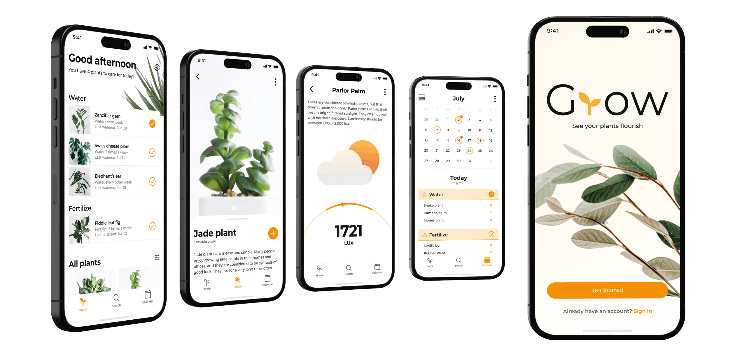
The Goal
High Level Goal
Design a user-friendly interface for a plant care app which helps people keep track of their plant’s health by providing a care schedule and all the necessary plant care information in one place.
The Approach
To kick off this project, I began with in-depth research, including analyzing competitor apps and conducting interviews with plant owners to understand their needs and preferences. This process helped in crafting the persona and mapping out the user journey, all while considering potential challenges. Additionally, the interviews allowed me to identify key areas of focus. Following this, I went through multiple iterations of the app design before finding the layout that resonated with the target audience. Afterward, I proceeded with high-fidelity prototypes and established a cohesive visual language for the app. Finally, usability testing was conducted to identify and resolve any remaining issues or inconsistencies.
Research
Competitor Analysis Insights
- Most apps specialise either in identification, reminders, or care instructions. There isn’t an all-in-one app that could do all of these things.
- Some apps allow customisation for plant care schedules and instructions to suit user specific plants and conditions.
- Most apps send notifications to the user to notify them if their plants need care such as watering, fertilising, etc.
- Different apps have different types of information available for one plant species, such as watering, fertilising, light, soil, repotting, humidity and etc.
Survey Insights
- The primary challenge reported by survey participants was the task of managing all their plant care schedules, particularly as the number of plants increased. This added complexity to the care routines.
- Another issue that participants faced was going on vacation and sharing care instructions with a friend. Some would write the instructions, and some would just mention it and hope for the best.
- Some participants mentioned that the apps they currently use can become overwhelming and annoying if they receive too many notifications and can’t adjust them.
- Participants who used apps to track their plant health emphasised the importance of having a customisable app. This app should allow them to adjust notifications for each individual plant.
- Finally, a lot of participants mentioned that it would be nice to have some form of plant identification not only for species but also for plant issues.
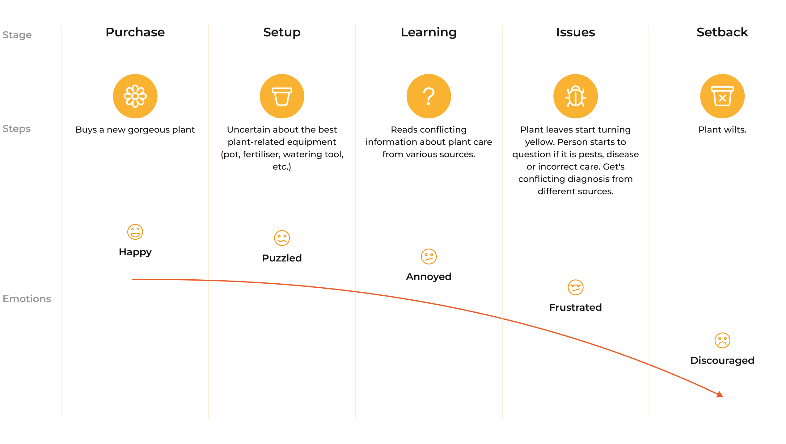
User Journey
Persona
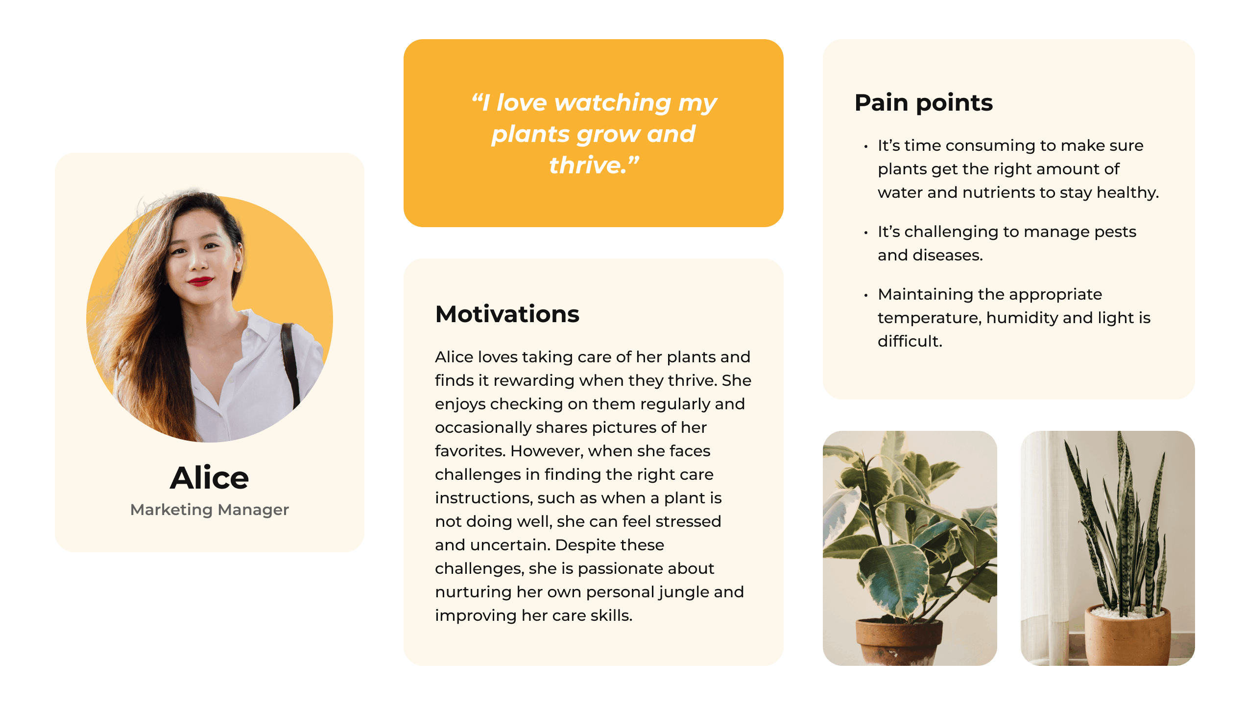
The different insights and patterns that were revealed through the survey helped me create a plant owner persona.
Meet Alice! She is a marketing student who works as a Marketing Manager for a digital brand. She spends a significant part of her week working from home, so she likes to make her space feel green and alive. She has a “personal jungle” as she likes to call it. It’s all the plants that she has collected over the years. Now she owns over 30 different species.
Visual Design
After completing the research phase, I moved on to crafting the low-fidelity wireframes and refining the design with each iteration. By incorporating a cohesive visual language, I ensured that the design was both aesthetically pleasing, user-friendly and accessible.
Logo
The app name is “Grow”, a name that perfectly encapsulates its purpose in helping users grow their plants with ease. To keep with the app’s simple and intuitive nature, I designed the logo to be a sleek and uncomplicated representation of its effortless functionality.
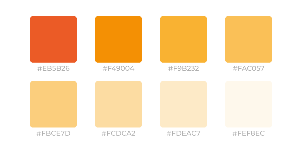
Colour Palette
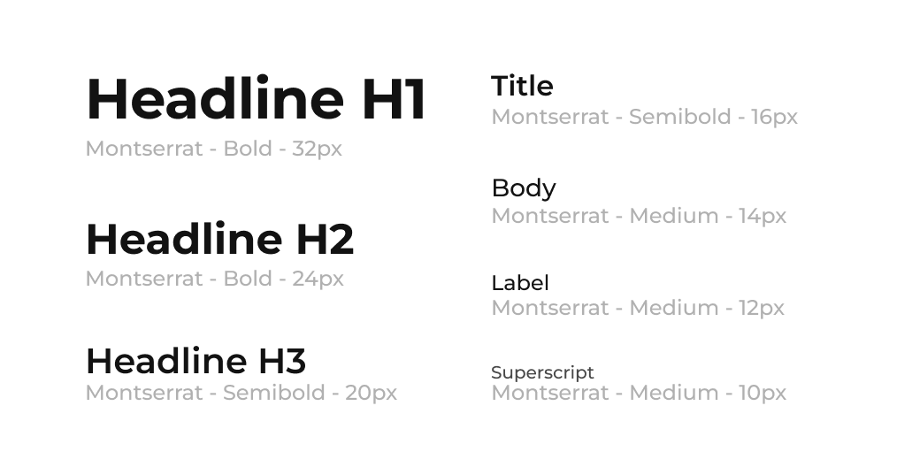
Typography
Iconography
To enhance the user experience, improve clarity of available actions, and ensure visual consistency, I incorporated these icons.
Solutions
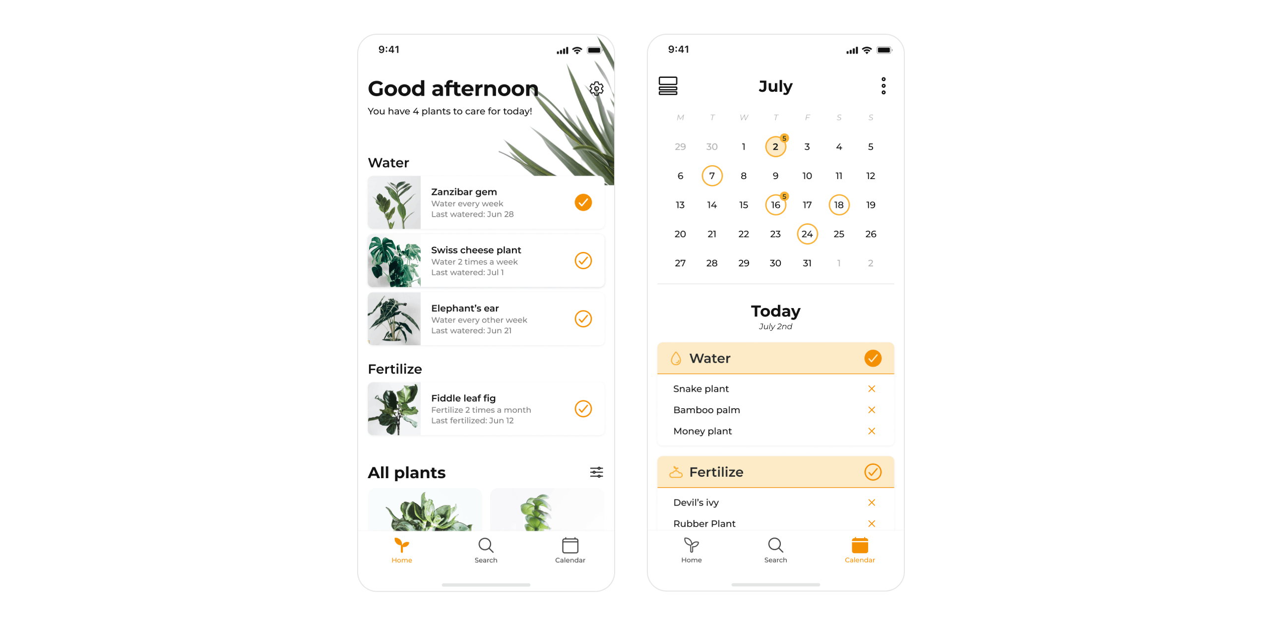
Overview Screen
In cases where multiple care reminders are dismissed in a row, it would trigger an inquiry. This inquiry would help the user fine-tune the reminder settings to prevent the app from becoming overwhelming.
Sharing Functionality
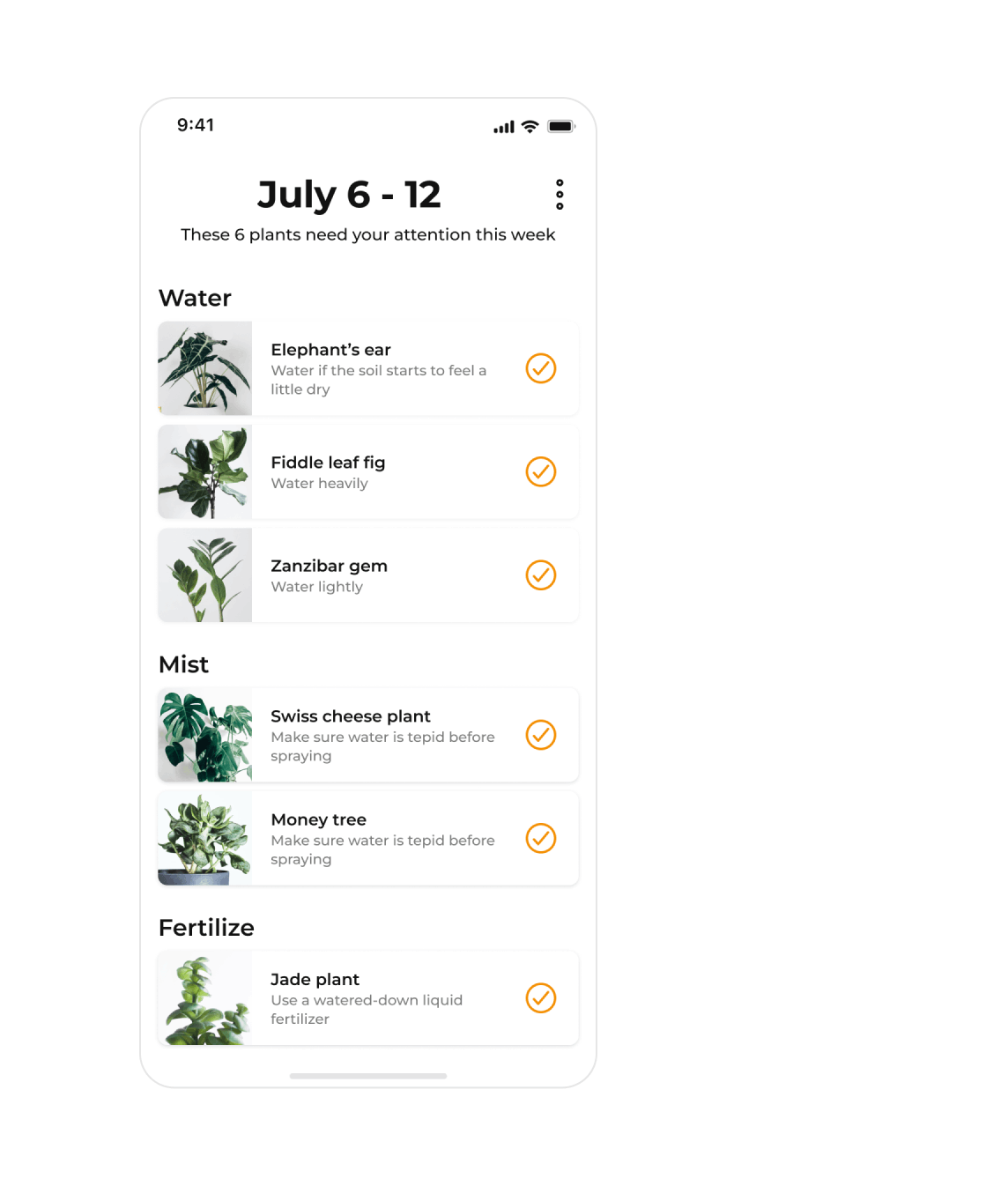
When the user goes on vacation, they can easily share all their tasks with friends through the sharing functionality in the calendar menu. They simply select the dates when they will be away, and the app will automatically add all the necessary tasks for their friend to take care of.
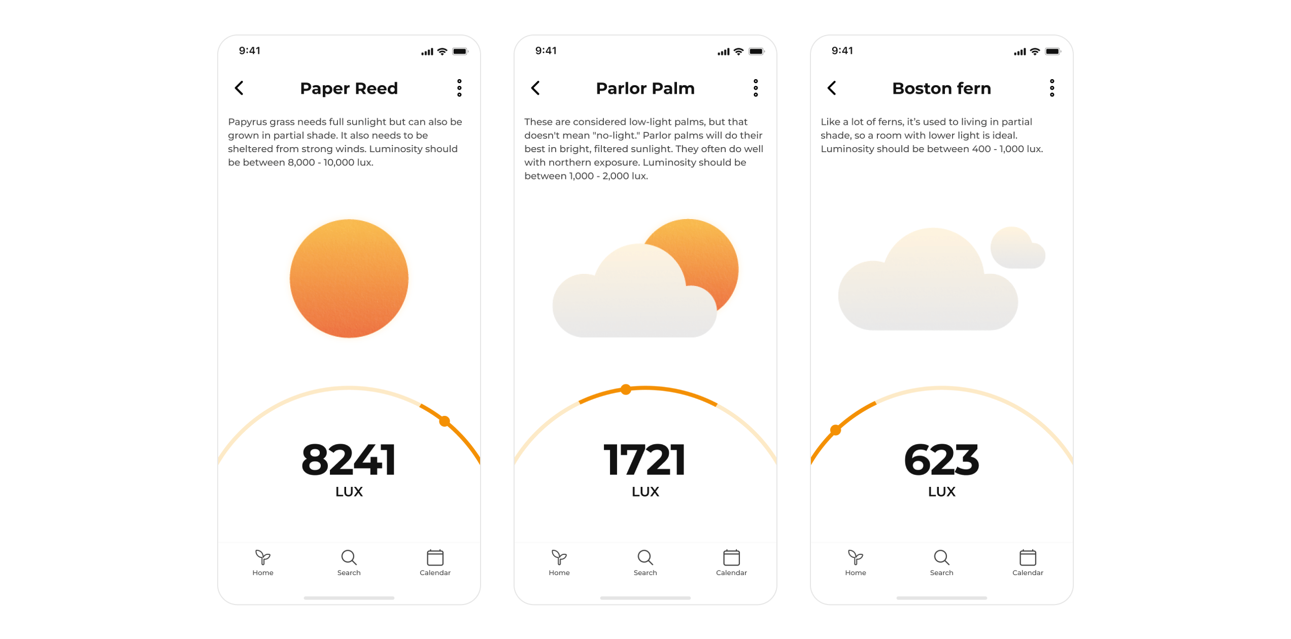
Light Sensor Feature
Using the phone’s light sensor, the user should be able to monitor their plant’s light exposure, ensuring that the plant receives the correct amount of light based on its species. This feature allows users to ensure their plants grow in optimal conditions.
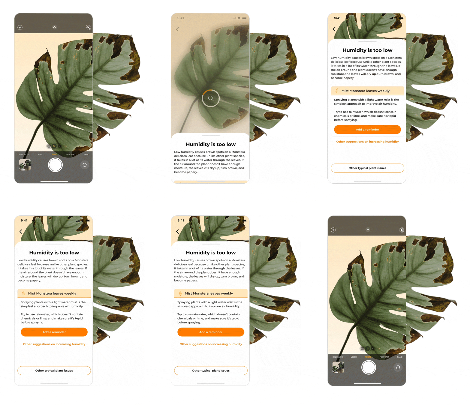
Plant Identification and Issue Resolution
One important feature that users wanted was the ability to identify their plants and any issues they may have. Users could take a photo of their plant, and the app would use AI technology to identify the issue, based on the plant’s care instructions, appearance, and general knowledge about the plant. This feature would alleviate the stress that every plant owner faces when their plants are not doing well.
Challenges
Complexities of Plant Care
Plant care is not as easy as it may appear. Different plants require different conditions to thrive. Designing an app that balances design simplicity with the plant care complexity can be challenging. The app needs to provide users with enough information to care for their plants without overwhelming them with too much information.
Enabling the User
User Engagement
Plant care is a long-term commitment, and users may lose interest in the app if they do not see results quickly. Ensuring user engagement by providing users with useful and relevant information on a regular basis would be critical to the app success.