Inyova Website Redesign
Inyova is a well-established brand in Switzerland that offers sustainable investing. The project’s goal was to update Inyova’s existing website to provide a cleaner, more consistent, and scalable design for future growth, improve its performance in search engine rankings and update their marketing messaging. If you’d like to see the updated website, you can visit www.inyova.ch.
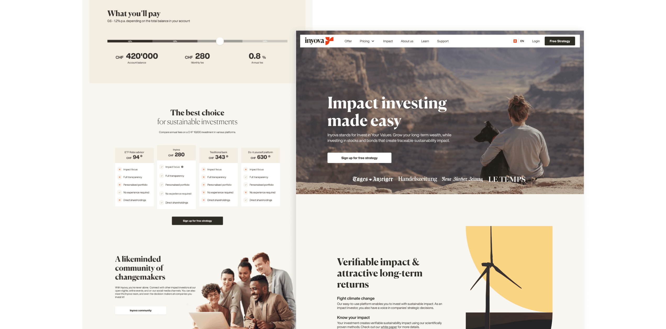
The Problem
Inyova’s website was built in 2018 when the company was created. It was effective initially, but once Inyova started to grow and evolve, its limits became apparent and needed to be fixed:
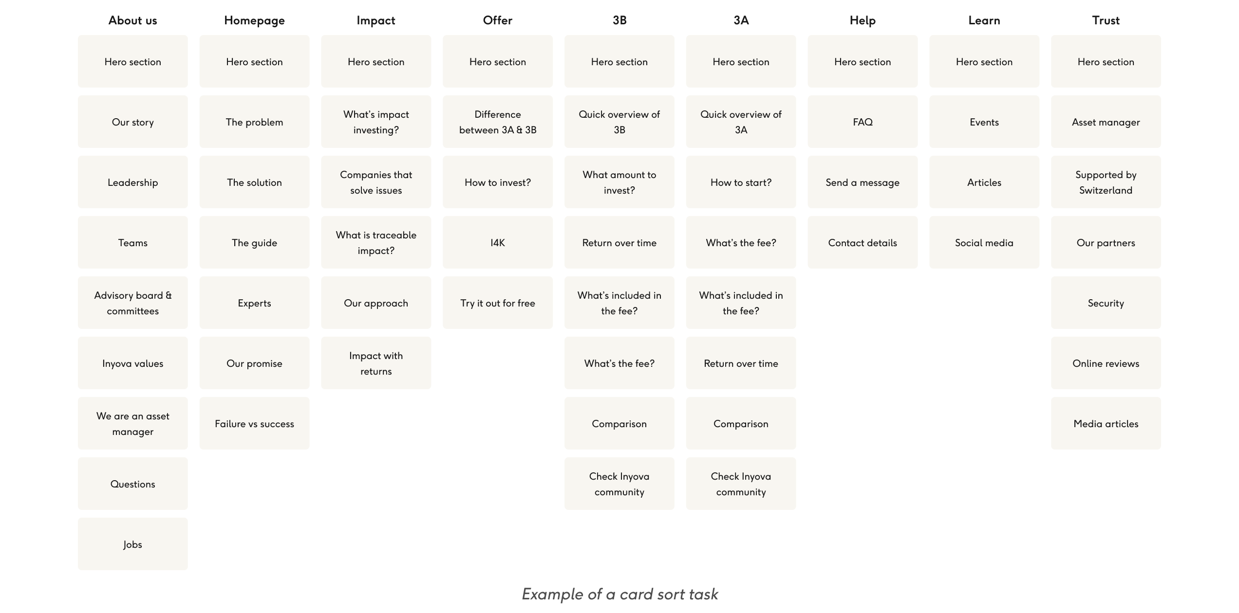
- The website was disorganized due to the lack of a design system and proper information architecture.
- Users had difficulty finding the information they needed.
- The website was challenging to scale when adding new subpages.
- Marketing team had to manually adjust article designs, leading to unintended variations.
- There were gaps in functionality.
- The website’s SEO needed improvement.
- The copy needed to be revised using the Story Brand framework to better align with Inyova’s marketing strategy.
The Goal
High Level Goal
The Approach
- Improve user experience: ensure that the website is easy to navigate and that users can find what they are looking for.
- Future proof: ensure that the website is clean and scalable for potential future products, with existing functionality improved and new features added to reduce the need for manual work and maintenance.
- Update brand messaging: the copy is rephrased using Story Brand framework with assistance from the Marketing team.
- Search engine optimisation: improve loading times, optimize images, improve accessibility, etc.
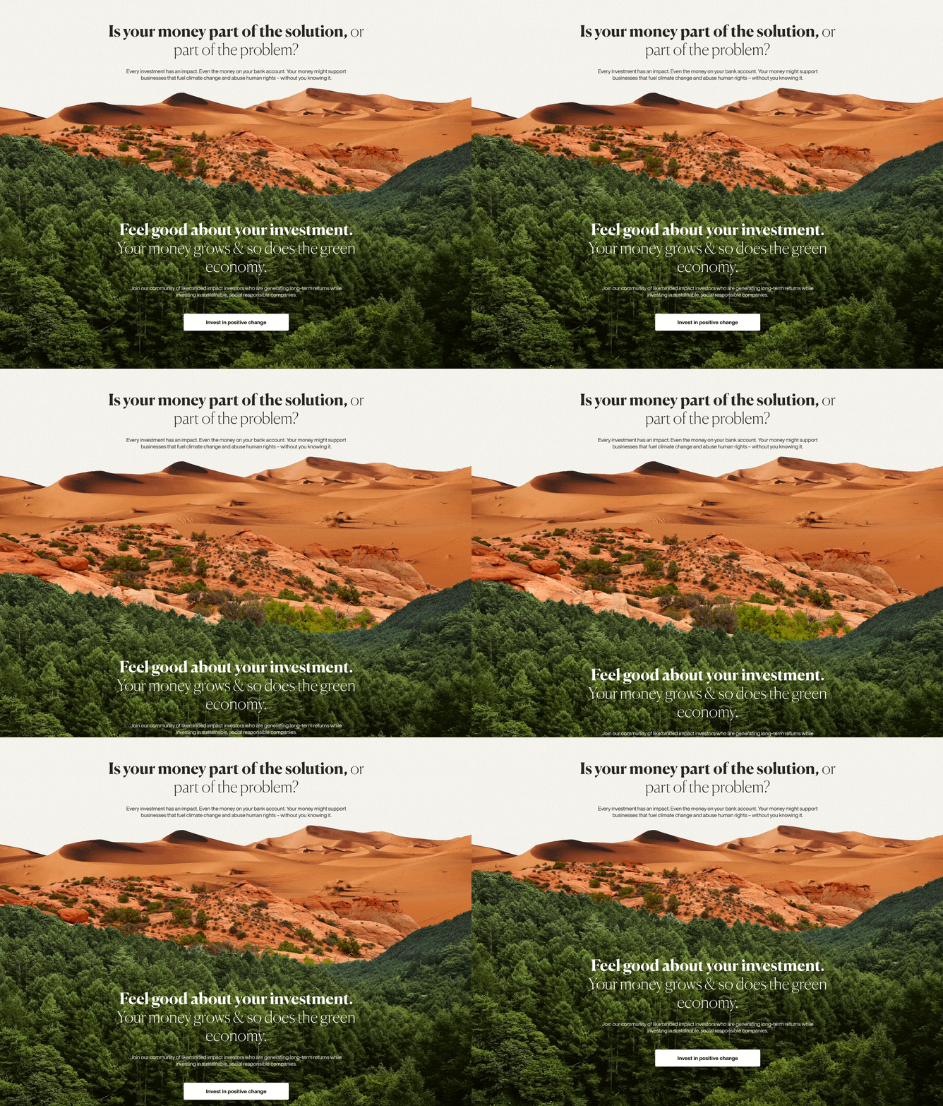
Taking Stock
Creating New Information Architecture
Design First vs. Copy First
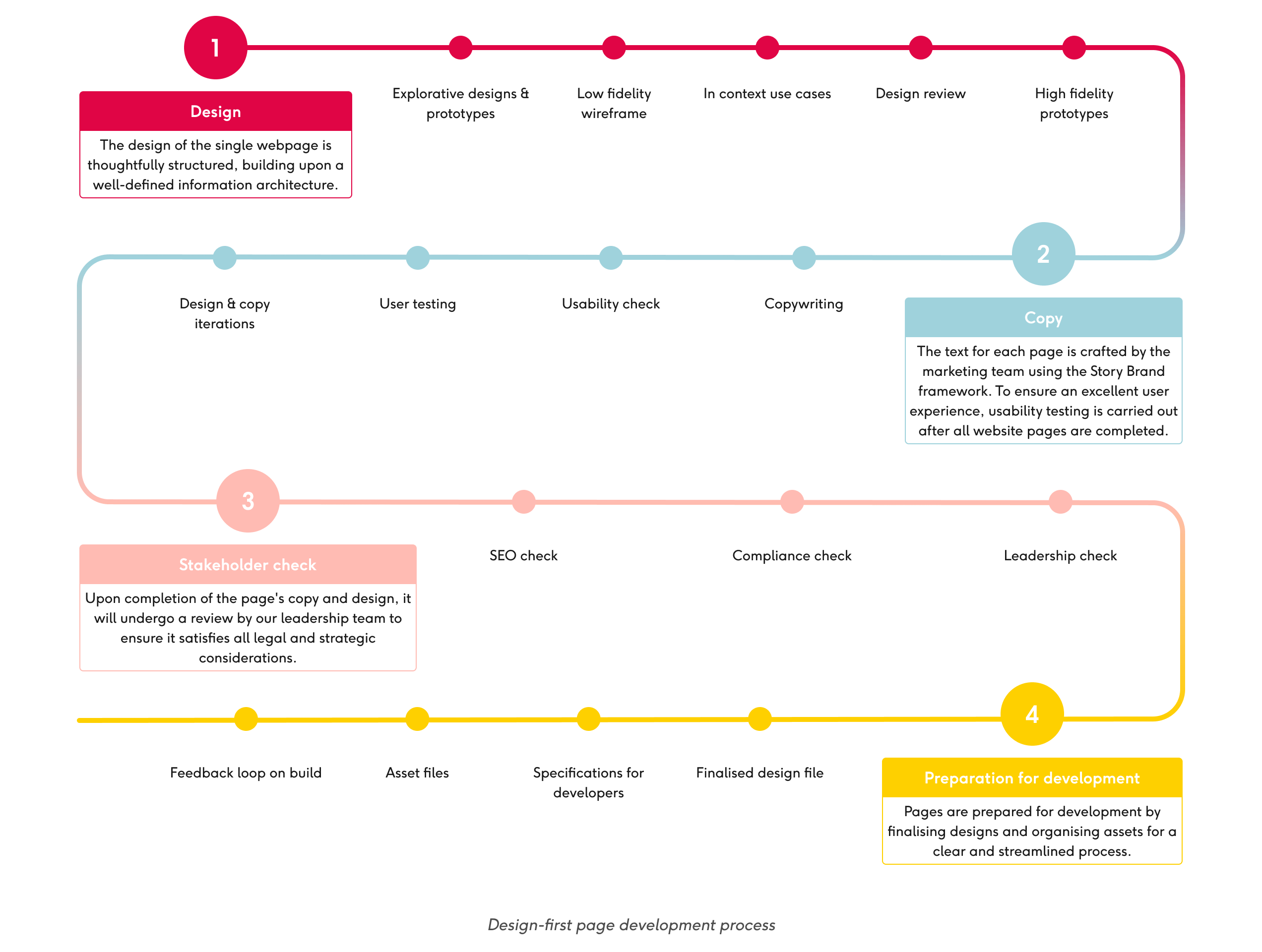
After both teams completed a single page, it underwent a standardised management approval process, which is illustrated below.
User Testing
After the completion of the new design, several rounds of user testing were carried out to ensure website usability and functionality. During the testing, special attention was paid to whether users understood Inyova’s unique selling proposition since investing can be a complex and overwhelming topic. Based on the findings, several improvements were made:
- Adding a comparative overview of the 3A and 3B investments to simplify their understanding.
- Making navigation naming as clear as possible.
- Ensuring that the website homepage communicates Inyova’s value proposition quickly and easily.
- Providing easy access to help.
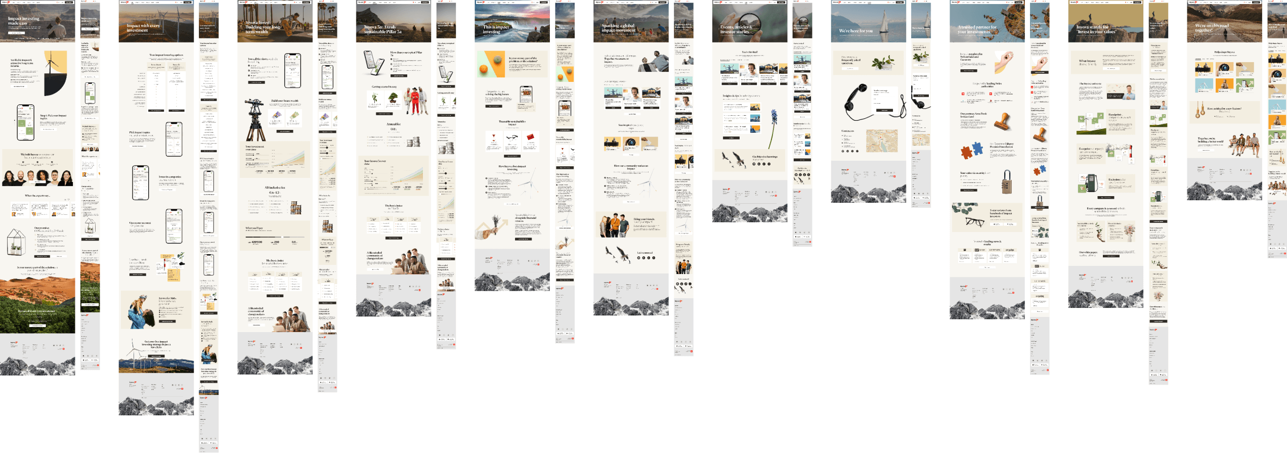
Additionally, users enjoyed the parallax effect on the website, so it was included in the final version. After implementing these changes, the website was ready for development.
Challenges
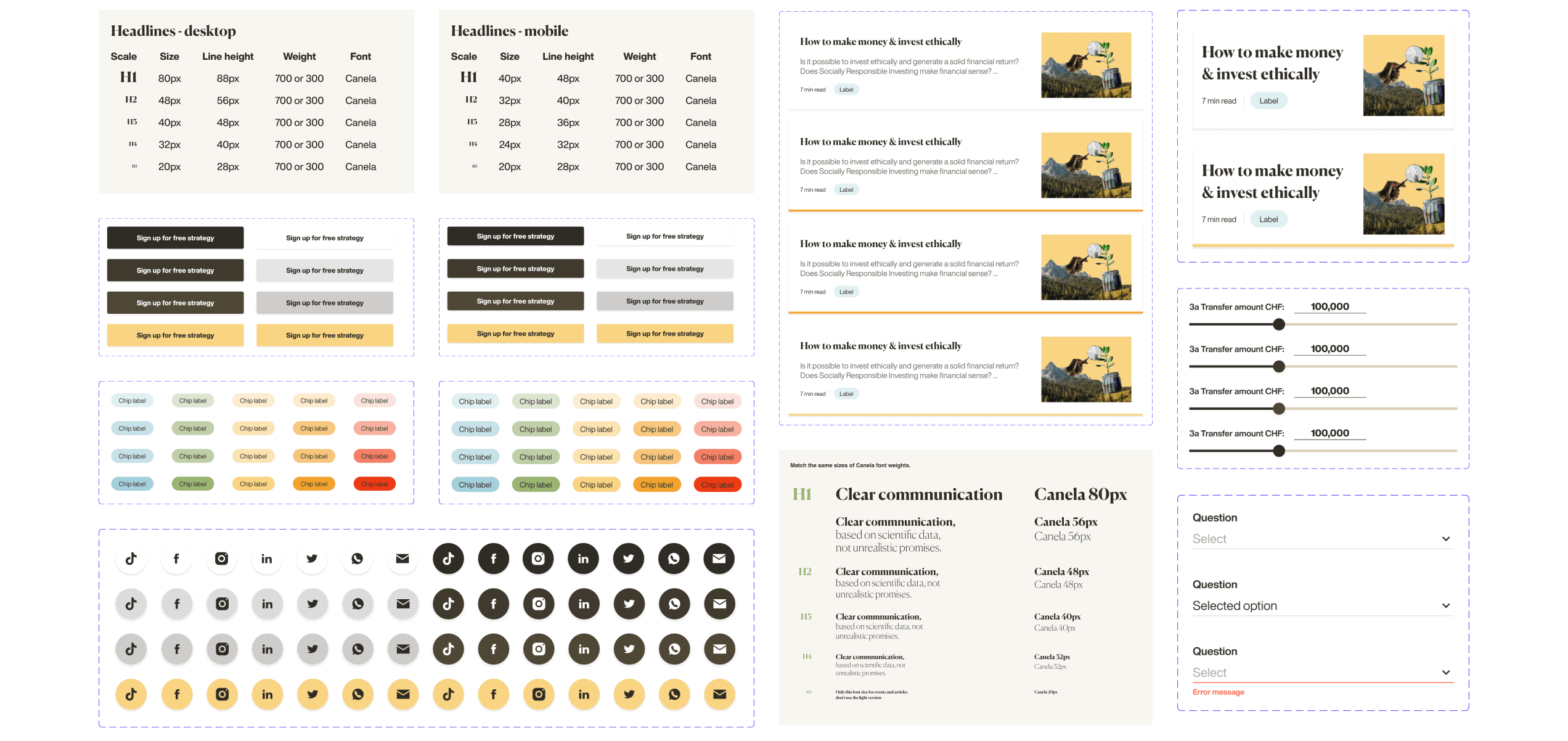
Creating Guidelines from an Existing Design
Communication
This project involved multiple stakeholders, including the marketing, customer success, people, design and development teams. Ensuring that everyone was aligned with the project’s goals was crucial. During the design phase, I actively engaged relevant stakeholders to gather their ideas, feedback, and insights. This collaborative effort not only helped to create a user-friendly design, but also a design that seamlessly aligns with our brand identity and user needs.
Changing Priorities
Midway through the project, business priorities shifted, leading to a temporary pause. Later, when it was resumed, it needed to be updated to include information about a new product. Subsequent design updates were straightforward and easy, thanks to the initial website design, which was created to be easily scalable. This approach significantly helped navigate the project’s complexity and adapt to evolving requirements.