Just Eat Menu Redesign
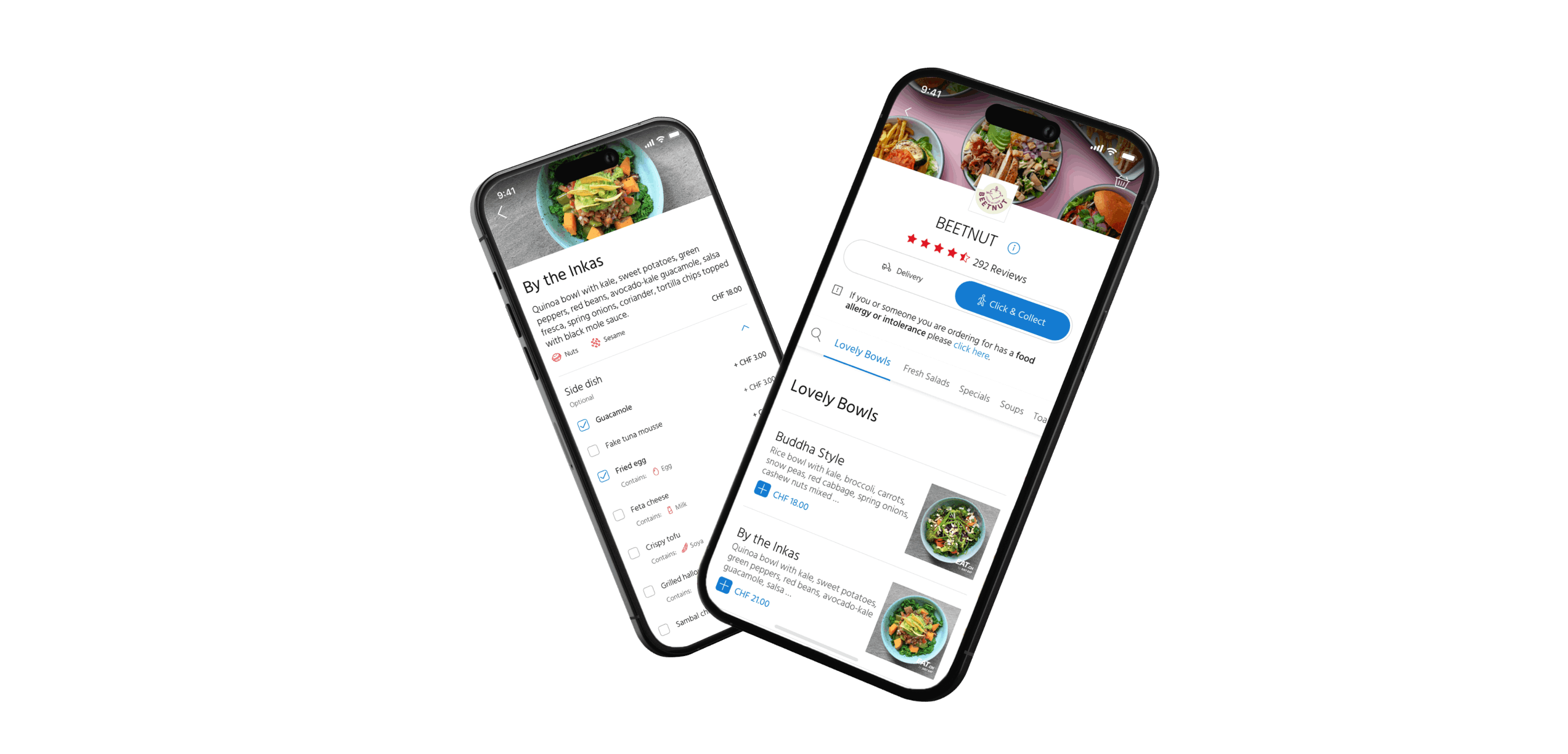
Just Eat is Switzerland’s largest online food ordering and delivery service, accessible across various platforms, including web, mobile (iOS and Android), and tablets. In the highly competitive food ordering industry, ensuring a seamless user journey is crucial. Therefore, the primary focus of this project was to redesign the menu appearance based on insights gathered from user research.
The Problem
Before this project, all of the implemented designs and layouts were created without conducting usability testing and had little consideration for the user.
For this project to prioritise the most impactful interfaces, I focused on mobile applications after observing that around 3 out of 4 users use mobile devices to order food.
The Goal
High Level Goal
The aim of the project was to identify usability issues in the current menu interface, determine critical fixes, and redesign menu based on insights.
The Approach
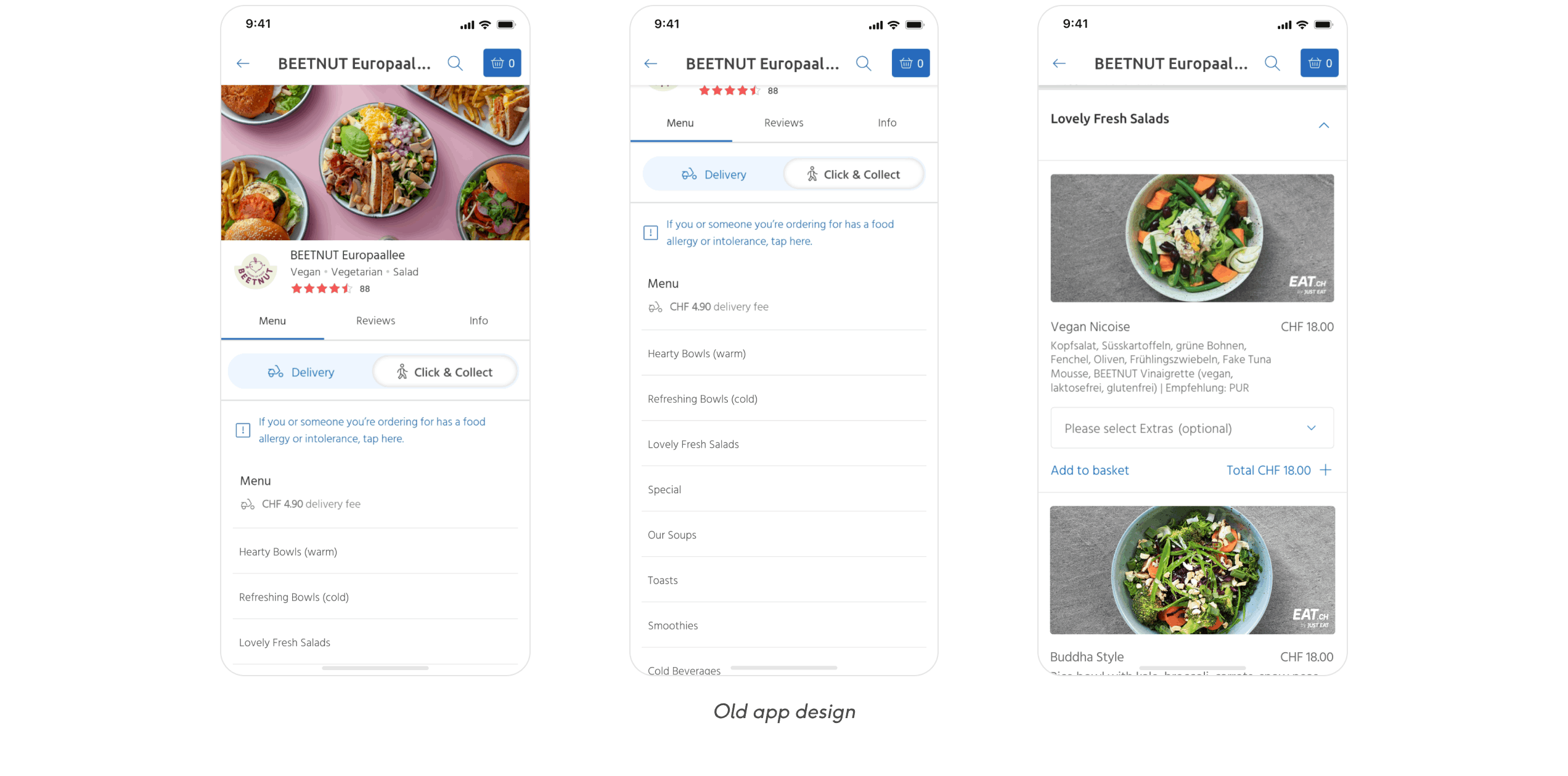
During usability testing, essential user tasks were prioritised, including searching for restaurant reviews, accessing dish information, and managing the basket. The findings from user testing revealed several issues:
- Unclear toggle states for “Delivery” and “Click & Collect”.
- Difficulty navigating the menu due to cluttered design and unclear information architecture.
- Colours used in the interface did not align with the Just Eat brand and was not accessible to some users.
Addressing the Pain Points
Toggle Update
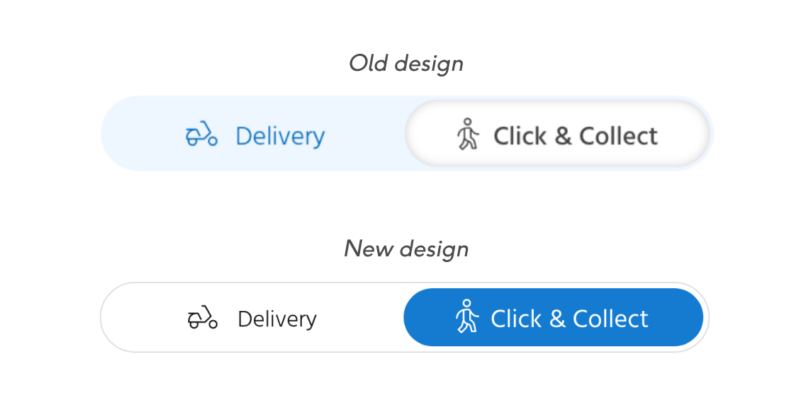
Many users found it hard to understand the toggle states for the “Delivery” and “Click & Collect” options and were confused about which option was selected. The main reason for this confusion was the use of blue colour for the deselected option, which goes against the common association of blue with an active or selected state.
To address this issue, the colours were reversed so that the blue colour now indicates an active state. This solution helped users better understand the toggle states and reduced confusion.
Improving Menu Navigation
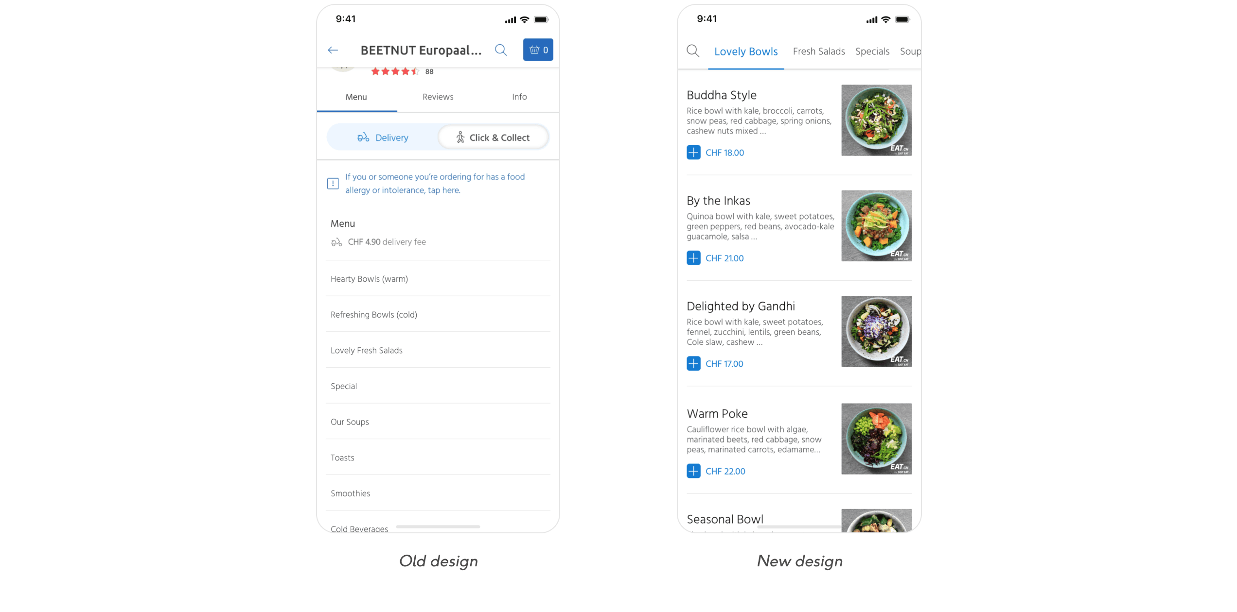
The menu on app has been difficult for users to skim through, as all the dishes are hidden within different categories. This makes it challenging for users to quickly check what type of food a restaurant offers, as they must open each category to see the dishes. Moreover, since each restaurant names their own categories, there are no agreed naming conventions, which makes it harder for users to develop shortcuts.
To address this issue, we have expanded the categories and introduced a category menu to make skimming easier and navigation faster. This means that users who already know what they want to order can quickly find it by using the search or categories. Those who are exploring can simply scroll through the menu.
Optimising Menu Layout
Users found it hard to differentiate between main and additional information on the menu due to similar font sizes of dish name, category name, description, and price.
To improve the user experience, I reviewed our information architecture and adjusted it according to what users had found to be most important within the menu. The categories were visually separated to provide a clear indication of category transitions while scrolling. On the dish level, key details were highlighted, such as the price and dish name. Emphasis was reduced for dish description and dish image, which users considered to be of secondary importance.
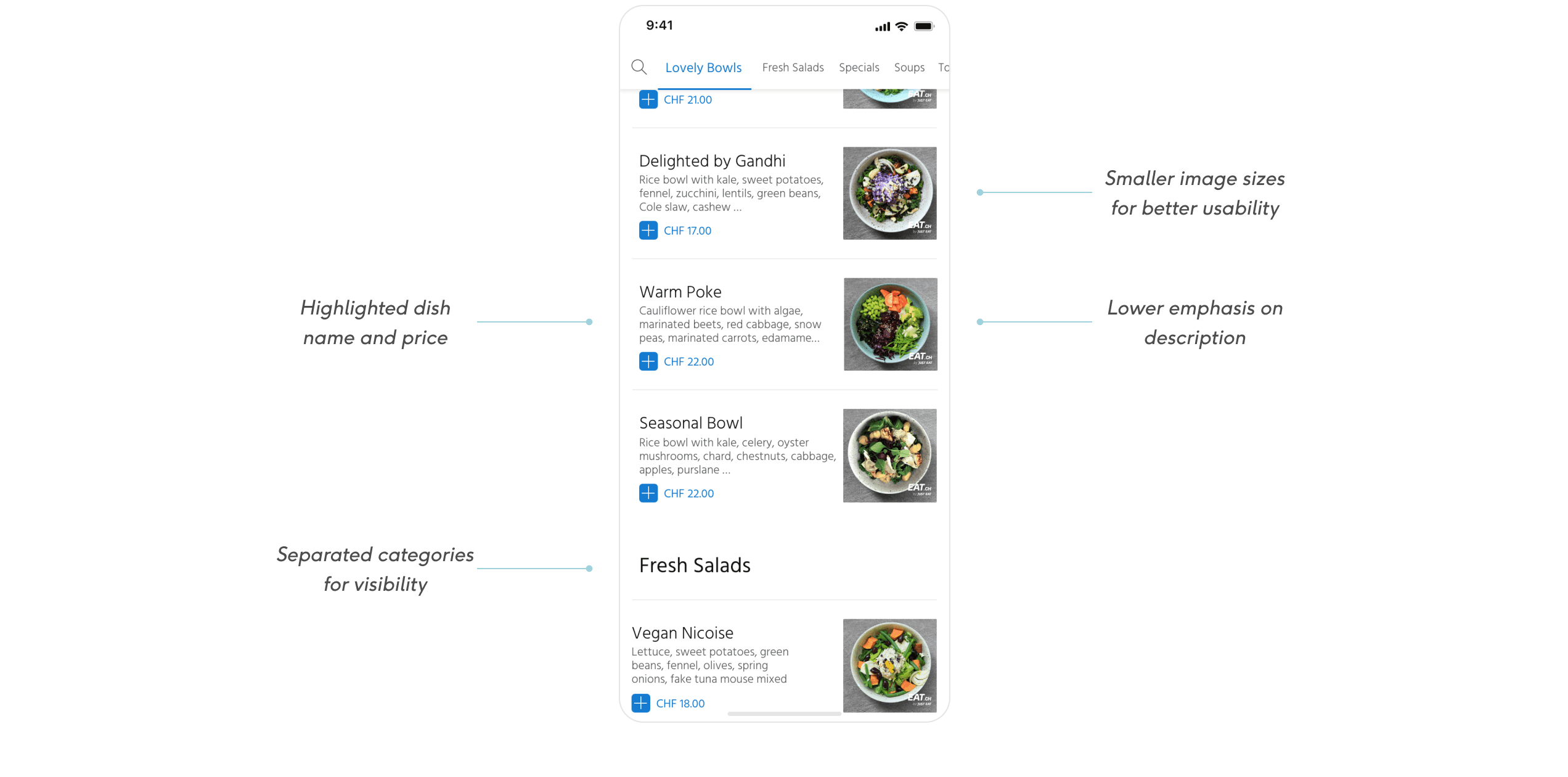
Introducing Secondary Screen for Complex Meals
Users found the current menu design cluttered and overwhelming, even though they appreciated the detailed information provided about each dish. To address this, secondary screen for more complex items was introduced, reducing the amount of information displayed on the main menu. Finally, dish image sizes were adjusted, as users found that larger images made the page feel disjointed and made portion sizes look smaller.
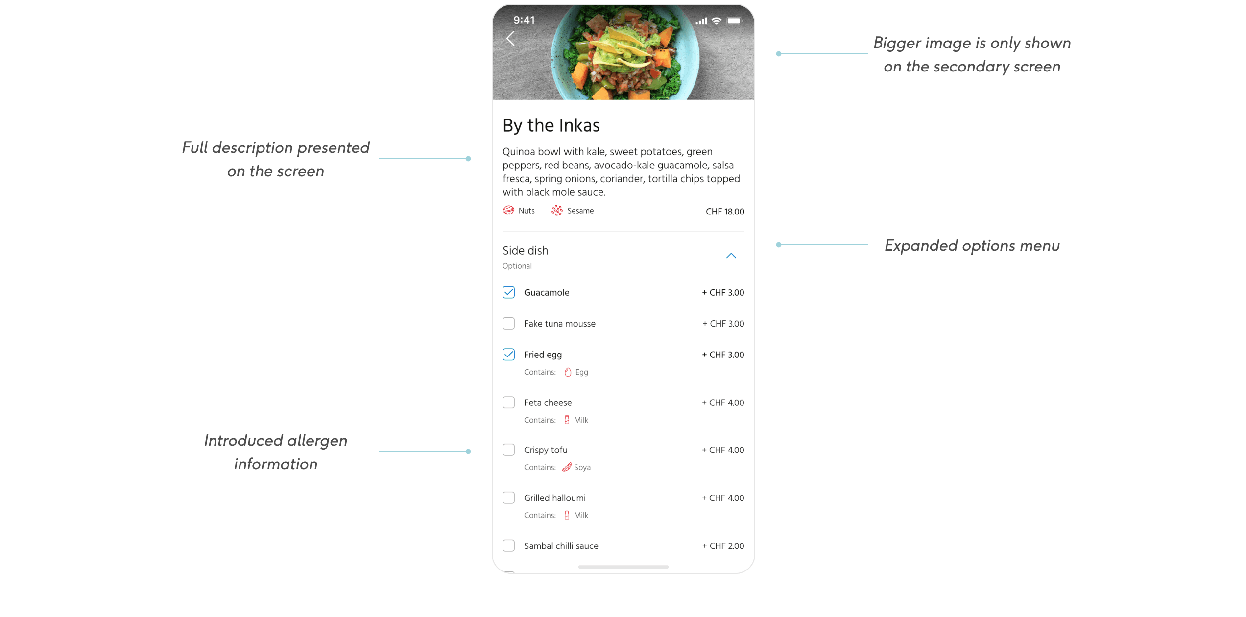
Reducing Visual Clutter and Improving Accessibility
Users had commented that colours used in the restaurant menus looked pale, blended in with the background, and didn’t represent the Just Eat brand well. To solve this problem, the colour scheme was modified to create visual contrast and to better fit the Just Eat brand. Finally, the number of colours used in the menu design was reduced, boosting visibility of important elements.
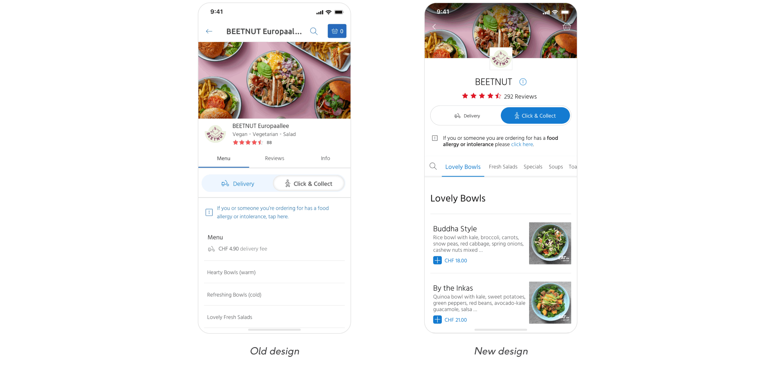
Challenges
Introducing User Testing
Before this project, Just Eat Swiss branch designs and layouts were created without conducting usability testing. I introduced the concept of user testing to the management. Emphasising its advantages, such as saving time for development and design teams, improving conversion rates, and avoiding the need for redoing work.
Finding Resources
While searching for a suitable testing platform for our needs, I discovered that the Just Eat UK branch was already using their own user testing platform. To set up studies for the Swiss market, I worked with the UK user testing team to learn how to use the platform effectively.
Accommodating Content Variations
With over 4000 restaurants to accommodate, each offering distinct menus, categories, food items, and numerous other variations inherent to the platform. It was essential to ensure that the menu redesign is not only user-friendly but also versatile and accessible.