Reimagined Design System
The goal of the project was to define a comprehensive design system that would streamline the design process and ease the work for the development team. This included everything from defining the fundamental design elements to creating complex components, all while keeping accessibility and user experience in mind. The aim was to create more room for creativity and less room for repetitive tasks that don’t add value to day-to-day tasks.

The Problem
Inyova platform had design inconsistencies, with multiple variations of the same elements – from buttons and icons to input fields – having different visual styles. This made it challenging to maintain design consistency across the web and mobile apps, as each designer would update elements differently. The aim of this project was to address these issues by establishing visual and behavioural consistency across the platform.
The Goal
High Level Goal
Enhance the user experience by achieving visual and behavioural consistency across the platform through the creation of a component library for designers and developers. The design system would simplify the design and development process and make day-to-day tasks easier and more efficient.
The Approach
- Increase the productivity of the design team.
- Reduce the number of Quality Assurance tests needed.
- Reduce the workload for developers.
- Update components while considering accessibility.

From Foundations to Complex Components
Fundamentals
Creation of the design system began with the definition of basic design principles and guidelines. This helped ensure that these principles could be easily applied to both new and existing components, saving time and increasing consistency throughout the system.
The fundamentals that were considered when creating the design system included:
- Typography
- Iconography
- Colour
- Layout
- Grid systems
- Interaction
Definition of these core elements ensured that every design component followed the same basic principles, resulting in a more cohesive, consistent, and accessible design.
Components
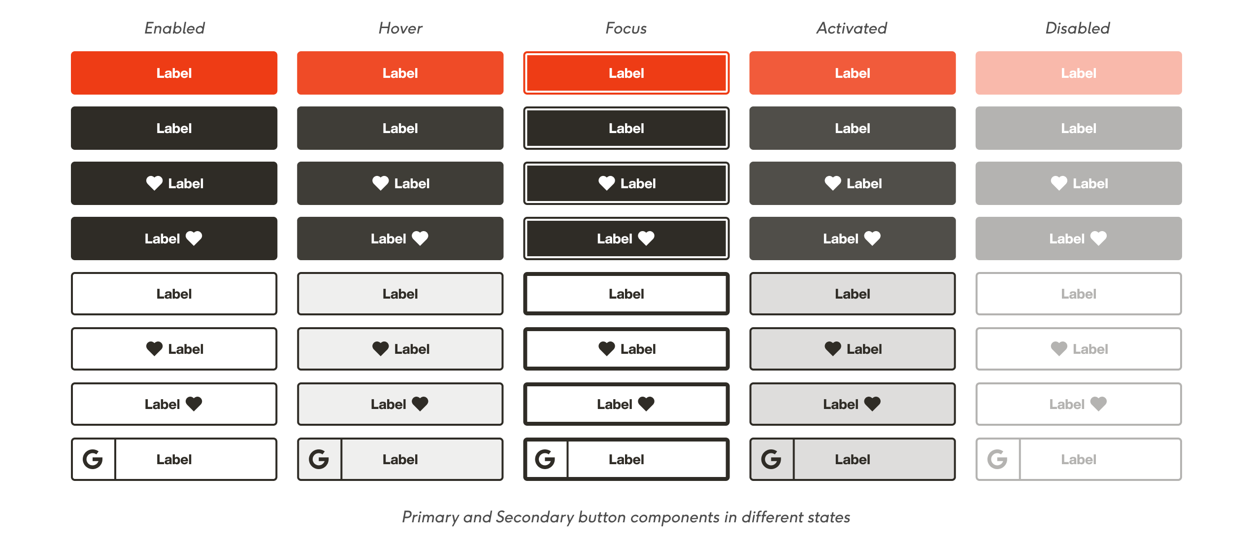
To ensure the best user experience, more important and commonly used components were user-tested. This approach allowed to make the necessary updates while minimising any negative impact on the user experience.

Complex Components
Finally, design guidelines and specifications were created for complex components, which consist of multiple smaller elements.
For instance, a phone number input field might consist of an input component for the number and a dropdown component for the country code, each having its own set of guidelines and specifications. When combined, they create a more intricate phone number component.

Component Process Map
The process of component design involved identifying the each component’s importance and usage frequency, conducting internal audits and external research, designing and iterating with feedback, creating documentation, and publishing the component in Storybook for easy access. This ensures that the components are well-designed, documented, and easily accessible to the design and development teams (see the more detailed process below).

Challenges
Design Inconsistencies
Creating an efficient design system was challenging due to inconsistencies in the existing designs caused by multiple designers working on different parts of the platform and a lack of clear design guidelines. Resolving these inconsistencies was crucial to improving the overall user experience and navigation.
Organisational Culture
Gaining stakeholder approval and securing resources for the design system posed a significant challenge. Despite the importance of the system, it was difficult to convey its benefits since the old way of working did not seem to hinder everyday operations. As a result, it was crucial to effectively communicate the value of the design system to stakeholders and illustrate how it could enhance the user experience and streamline operations in the long run.
Legacy Code
The implementation of a design system was complicated by the legacy code on the existing platform, which lacked consistent design and coding standards. As a result, ensuring a uniform design system across all components proved to be a challenge for the developers.